
Monday, October 31, 2011
Wednesday, October 26, 2011
Irish's Woods

Finished a new illustration. Its horizontal, "bottom-of-page" quality would be good for adding text to- that type guy I heard a few weeks ago has me thinking of graphic design again. I may fuss with this later.
Regarding Red Fox, I know exactly the spot in Hickory Hill Park- known as Irish's Woods once upon a time- I used for background. There's a patch of birch close to the trail and I love the chalky white bark.
This new Red Fox in the Woods and the Pheasant Hill piece are both on my Etsy shop site available as small prints:)
Tuesday, October 25, 2011
Happy Birthday, our Teenager

Thirteen years ago to this day, our daughter was born. On October 25, 1998, Dan and I spent some time at Wilson's Orchard, then a walk at Lake Macbride, followed by a pork tenderloin sandwich at Joensy's in Solon. It was the sandwich that probably heralded Lucy's arrival at 11pm that night. I can't believe she is now a teen.
I created the illustration above for her announcement. Inside, we listed all the cool Lucys we knew; all the literary ones (from the Lion, the Witch and the Wardrobe, EM Forster's Lucy Honeychurch in A Room with a View); to others from various arenas: TV's I Love Lucy; Lucy Australopithecus, Lucy in the Sky with Diamonds, Lucy from Peanuts and there are more. She lives up to all her namesakes in one way or another. Happy Birthday to our Lucy.
Thursday, October 20, 2011
Baby board books go Big


Daughter Lucy and I were in Prairie Lights Books last week and I noticed a re-issue of The House in the Night- the Caldecott picture book winner from a couple years ago. It's now in board book form, but it is immense- thick as an Iowa pork chop, maybe two inches or more. Regard the middle photo- I have one of Sandra Boynton's classic board books on top for comparison. AND, other new board books close by were equally as chunked out. Not for little hands anymore. Then, also very weird to me is a new thing called a "lap book", which is a board book but a standard PICTURE BOOK size, like 14" by 16". Lucy is holding another re-issue, of Goodnight Moon. Lovely as a small board book, but this new lap book rendition is gi-normous. They are odd, because they are too heavy for a child to open easily themselves. And that is part of the charm of a board book. What gives? Board books should be one of the last genres- if ever- to go digital, as they are meant to shared with the very young and give these smallest of "readers" a chance to explore Story on their own terms. But I'm not sure if making bigger board books is all that good a trend. Maybe making picture books these extreme size board books- morphing the two kinds of formats- will give them both more staying power. What will the face of story-telling look like for the youngest in the next few decades?
Friday, October 14, 2011
Soft as an owl feather

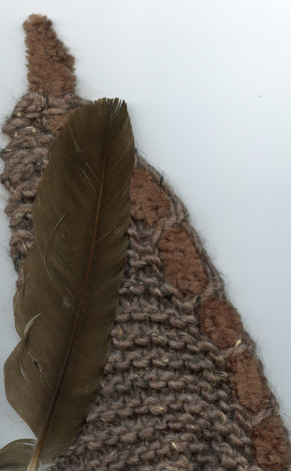
Today, the rain is at my studio window, driving a few more leaves from the trees. Time to get out all things cozy: sweaters, comforters, wraps... Recently, I received a wonderful knitted shawl the soft brown shade of a saw-whet owl. Just in time for the change in temperature. It inspired an illstration. Check out the full story behind my shawl- and see picture of it!- at my writer and illustrator (and extraordinary knitter) friend Michelle's regular column for Lion Brand Yarn.
http://cache.lionbrand.com/cgi-bin/lionbrand/displayCustomerProjects.fcgi?projectKey=104820&displayType=lit
Monday, October 10, 2011
Leaves; something to be desired

Some fallen leaves look scratchboarded by nature. Check out the black veins on the crimson maples. Found on my morning walk.
Thursday, October 6, 2011
Mad Dogs and Englishmen

Coffee, l love, but black tea is in my DNA. I drink it in "the midday sun" for sure (a nod here to Englishman Noel Coward and his odd Colonialist lyrics.) I have a cuppa with milk and a small biscuit almost every afternoon. A personal ritual like this is the reward (or the distraction) of an afternoon's work.
Recently, my favorite tea pot came up missing. I know, how can a ceramic teapot just disappear from a household? Every cabinet searched. Every corner examined. No tea pot. During summer, I drink less hot-from-pot tea, so I'm not sure when I last saw this beloved vessel with the most exquisite turquoise glaze. I've illustrated this tea pot I was so fond of it. No one who lives here is giving me any details of it's departure. I'm suspicious. Anyway, it's gone now, and I accept the loss. So I bought a replacement yesterday at the Artisans Gallery. It's another ceramic one- the artist's name escapes me, but I will locate it and post it later. It's a beautiful round shape, very much a Brown Betty with an earthy glaze. So I've call her Betty, my new tea pot. I hope she brings forth many a good cup of tea, and conversation and inspiration in the years I have her. Come by for a cup, even if you're not a mad dog, or English!

Wednesday, October 5, 2011
Oh, Wondrous Type
Book Art royalty came to Iowa City last week. Matthew Carter, legendary type designer, gave a lecture at the University of Iowa. Carter is known for creating many well-known type faces we use and read daily. One of his largest clients is the New York Times- he does the iconic black letter for the newspaper masthead.
Listening to his lecture made me think of art school, when I pondered the very being of a letter; its shape, flavor, history. I cut my graphic design teeth on Carter's beautiful letters. Snell Roundhand is still a favorite:
 Carter, his silver pony-tail adding a visual serif to his elegant personage, talked about homage to ancient type. He is known for taking very old faces- think Roman times, and the early printing alphabets- and making them modern. A flat top to a “t” here, a higher x-height there. Names like Bodoni, Fruitiger, Caslon are to many of us just names of fonts, but they were all real people, designers of type, whose work lives on through Carter. Carter says he is informed by history. He likes to “marinate” himself in these studies. And it’s not about copying. “Accuracy is not the truth”, Carter says, quoting Henri Matisse. He makes type faces for the 21st Century eye to play upon and enjoy.
Born in the U.K., Carter lays a rose at Caslon’s 17th century tombstone whenever he visits London. Now that is paying respect to a vocational ancestor.
To read more about Carter's interesting take on Kindles and other reading devises, visit this profile in the Iowa Review:
http://iowareview.uiowa.edu/?q=fresh-blog/dec-13-2010/very-cool-profile-matthew-carter
Listening to his lecture made me think of art school, when I pondered the very being of a letter; its shape, flavor, history. I cut my graphic design teeth on Carter's beautiful letters. Snell Roundhand is still a favorite:

Born in the U.K., Carter lays a rose at Caslon’s 17th century tombstone whenever he visits London. Now that is paying respect to a vocational ancestor.
To read more about Carter's interesting take on Kindles and other reading devises, visit this profile in the Iowa Review:
http://iowareview.uiowa.edu/?q=fresh-blog/dec-13-2010/very-cool-profile-matthew-carter
Subscribe to:
Posts (Atom)